With a new year here, there are just as many new eCommerce design trends for 2016 that everyone needs to be aware of. You’ve set new goals and made some new years resolutions, many of them likely pertaining to your success. These trends can certainly get you well on your way to achieving just that. Changes in site design are typically a result of change in site usage. Data is taken and analyzed to see how your website can further provide for your customers. Mobile site use has been at an all-time high and will continue to be so during 2016. As such, eCommerce design patterns and now providing shoppers with a just-as-convenient shopping experience online. Here are some eCommerce design trends for 2016 to consider.
1. Card and Card-like Layouts
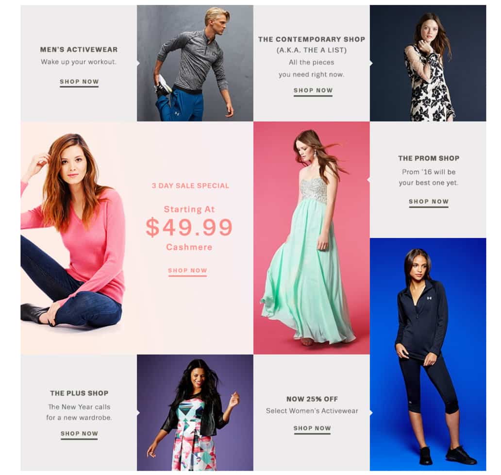
This term has been popping up over and over again when it comes to the eCommerce design trends for 2016. A “card” encases everything from images, text, and other resources that are all associated with a one topic. In other words, they’re boxes of content, with each consisting of content that relates around the same idea. They are used to organize different topics in an aesthetically pleasing and easy-to-use way. Car layouts also work flawlessly with responsive designs, which everyone should have by now. Google’s new Material Design (and Android) has also implemented this trend into the mix. On the Lord & Taylor website, cards are used to featured categories or products.
2. Pop-Ups and Interruption Merchandising
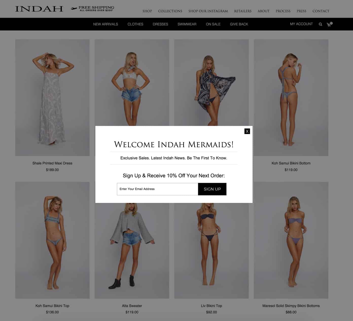
One of the most hated forms of online promotion definitely has to be the pop-ups. Many consumers have even installed pop-up blocking services to stop these interruptions from happening, but many web browsers now block them as well. The weird thing is that this kind of interruption marketing is actually making a big comeback within website design in 2015. Shocking, we know. The difference is the content on these pop-ups, as they’re much more beneficial to the consumer and believe it or not, less hated! 2016 pop-ups now consist of discount codes for signing up to a newsletter or for following social media websites, or special promotions that are available for a limited time only. As such, they shouldn’t be popping up every time someone enters your website, and sometimes they only pop up once the consumer has scrolled so far in the site. The Indah Clothing site is just one example of a large, omni-channel retailer using modals on-site to promote email subscriptions.
3. Large Photography and Videos
Large, high quality photographs and videos are saying much more than just a thousand words when used properly on eCommerce sites, and they can be the perfect way to captivate your consumer and make that sale! Designers and developers are able to optimize how these items can boost your site’s performance across all platforms as well. The homepage video on olloclip.com shows you how easy the device snaps on and the video quality you get from its use.
4. Hover Effects
One of the newest eCommerce design trends for 2016 is all about the smooth hover effects. They’re a CSS-based technique that can change certain components on your website when the mouse is on top of it. Some popular examples of how the hover effects are being used on eCommerce sites are by displaying detailed information when the mouse is over top of a product image. Or to display smaller images taken from different angles, or to simply change colors and shades of banners and links. This new trend can captivate your buyers’ attention by providing important details in an intriguing, user-friendly and aesthetically pleasing way. Greasegasandglory.com shows an alternate view of a particular garment simply by moving your mouse over it.
5. Custom-Drawn Illustrations
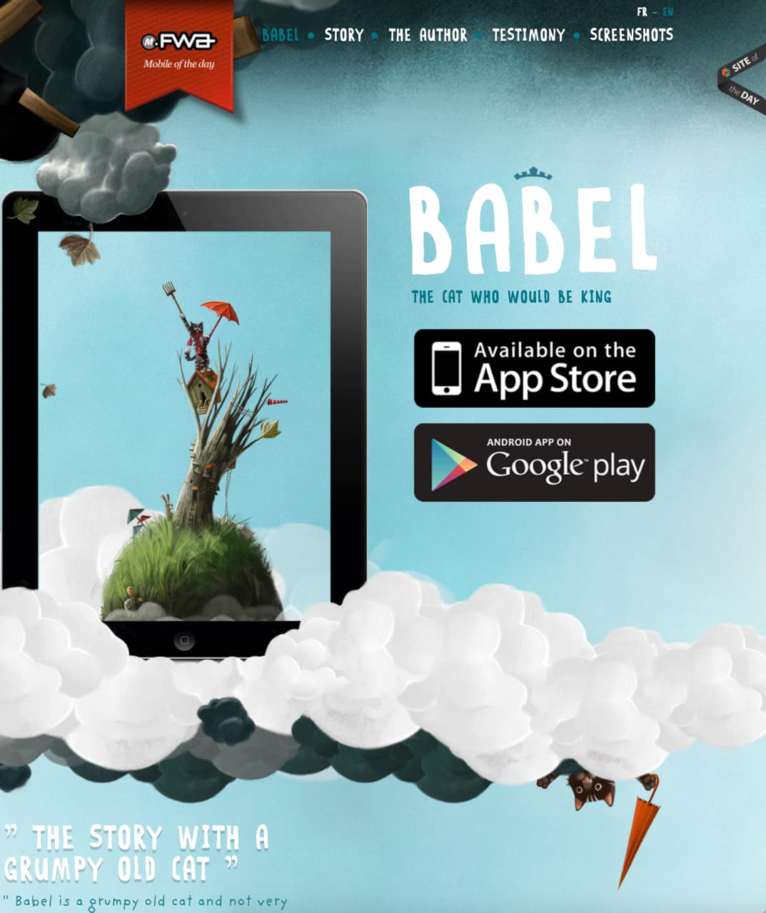
There are many tricks that a web designer can resort to in order to make your eCommerce store look unique. Custom-drawn illustrations are certainly one of the best that also happen to be a huge eCommerce design trend for 2016. Consider implementing small hand-drawn stickers into your website instead of generic ones found online, or large illustrated backgrounds. These small details provide a genuine appeal and unique experience for your customers. Just be sure to never compromise the usability of the site, or make it too crowded. Notice how Babel illustrates their elements to catch the imagination of their young audience.
6. Storytelling
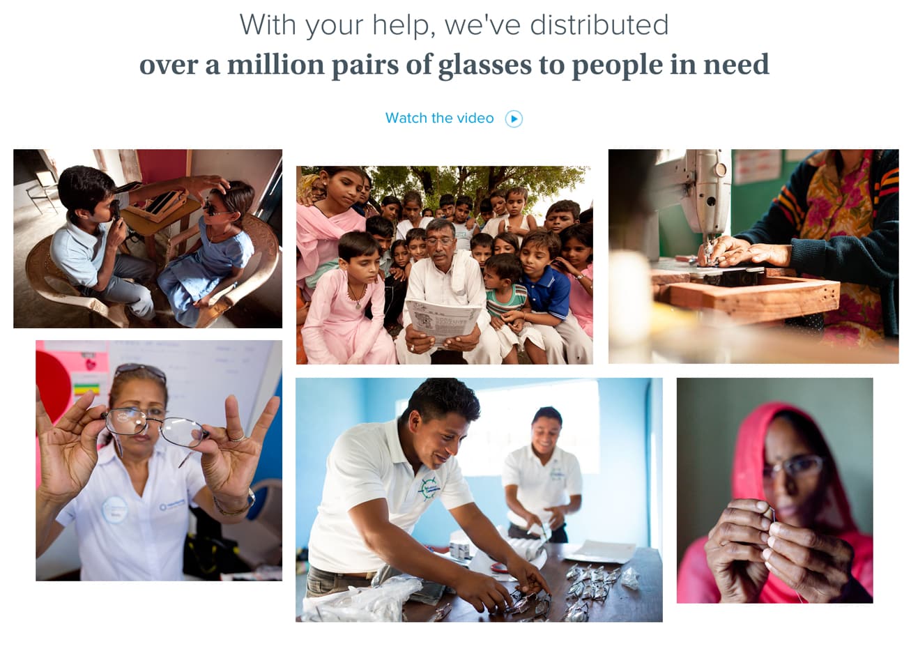
Storytelling is one trend that is thriving across all forms of web design, especially with eCommerce websites. This is an effective way to communicate your ideas to your consumers, by simply engaging them. Don’t just show your product; share a story that will arouse greater interest and intrigue customers to stay longer on your website. Eventually, if done properly, this will all result in higher sales. Consider using more than just words to convey your story. Many large retailers are using full in-screen background videos to provide answers to their customers’ questions in a fun and captivating way. Another example of how a brand can gain a level of respect and credibility by thinking of others and not just themselves. Take a look at how Warby Parker makes a huge difference by giving away over 1 million pairs of glasses to people in need.
If you’re ready to take the new year by the horns, these are the eCommerce design trends for 2016 that you certainly want to implement into your website.

